Visualization · Climate
A climate record drawn as a spiral
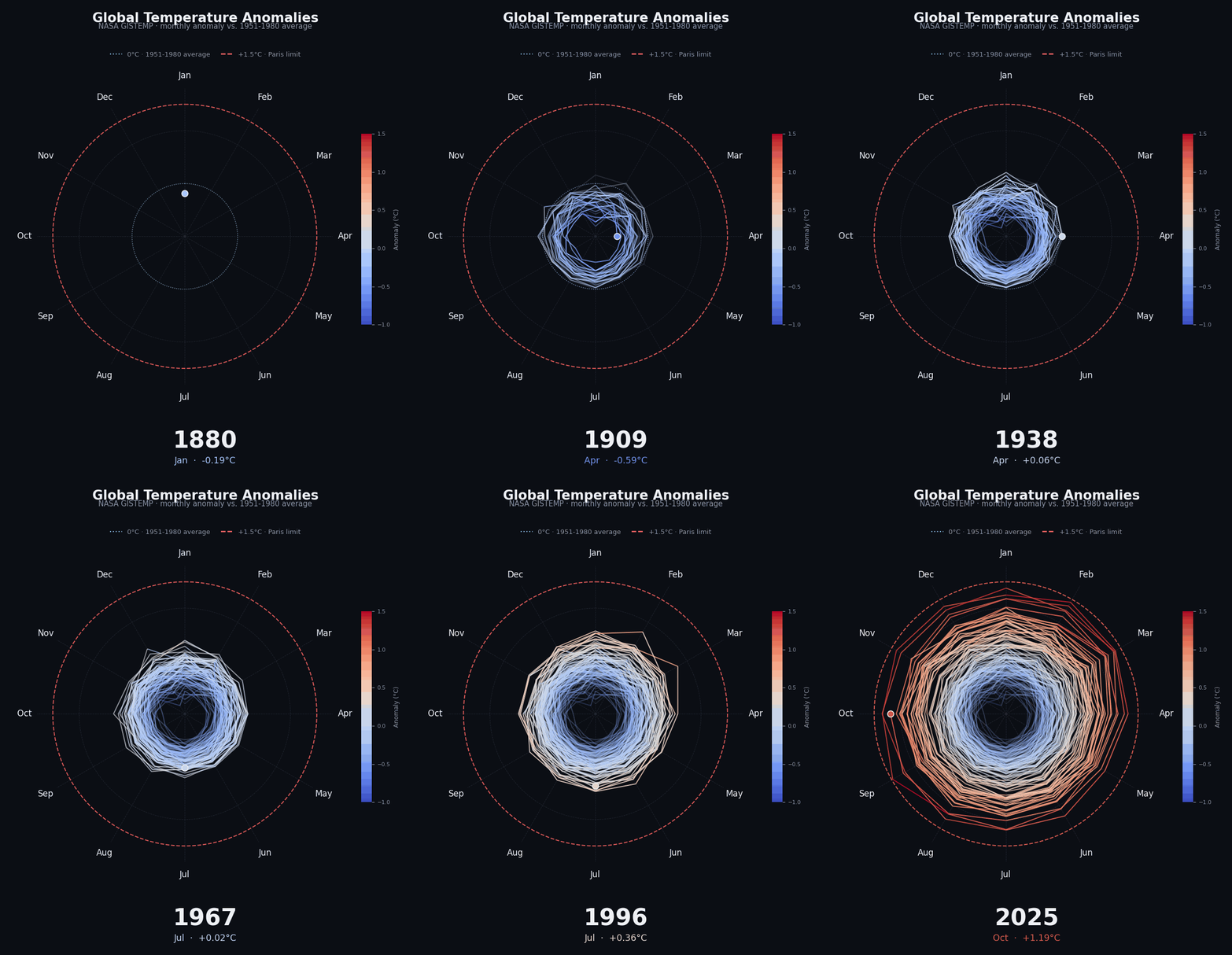
A spiral turns the repeating calendar into its structure, making the seasonal cycle visible while the longer temperature signal expands through time.
What the spiral reveals
Putting months around a clock face makes the annual rhythm familiar. Early years form a tighter shape near the centre, while later years extend farther outward, so the long-term signal remains visible without removing seasonality from the picture.
The spiral is not a replacement for a time-series chart. It is a different reading aid: it gives the recurring structure of the data a visual role and makes broad movement through the record easier to follow.
- Data
- NASA GISTEMP
- Method
- Pandas and Matplotlib polar animation
- Encoding
- Month, year, and temperature anomaly
How it was made
The data is prepared in Pandas and drawn frame by frame with Matplotlib’s polar projection. Months are placed at equal angles around the circle, while anomaly determines radial distance. The resulting frames are exported as an animated GIF.
Limitations
The view summarizes a global temperature-anomaly series, not local conditions. A radial display can make exact values and year-to-year comparisons harder to read, so it works best alongside a labelled data table or conventional time-series chart when precision matters.